The home page of your MSP's website is so important. Get it right and it will generate more leads. Here's how to fix it
Your website's home page is waaaaaaaaay more important than you think.
Imagine you owned a bricks & mortar shop in your town. What you sell inside that shop is of the best quality. People who buy from you, love it.
Problem is, your shop front is tired, tatty and intimidating to potential new customers. So they never walk through the door. They judge the book by the cover, and never get a chance to experience the quality of what you sell.
This is exactly what is happening if your website home page is tired, tatty and intimidating 😃 It's a metaphor. Your home page IS your shop front.

I've looked at a LOT of MSP's websites. Must be getting on for well over a thousand. And the 80/20 rule definitely applies. 80% of MSP's websites are REALLY BAD 🙁
Good news: You don't need to obsess over getting the whole thing to be perfect. Get the two most important pages - the home page and about us pages - to be as good as you can. And they will influence 80% of the ordinary business owners and managers who visit your site.
To help you get faster results, I'm going to be very prescriptive. Here are the 10 elements you need, in the exact order you need them (the order is dictated by what's going to most emotionally influence your prospects to feel like you are the tech support firm they have been searching for).
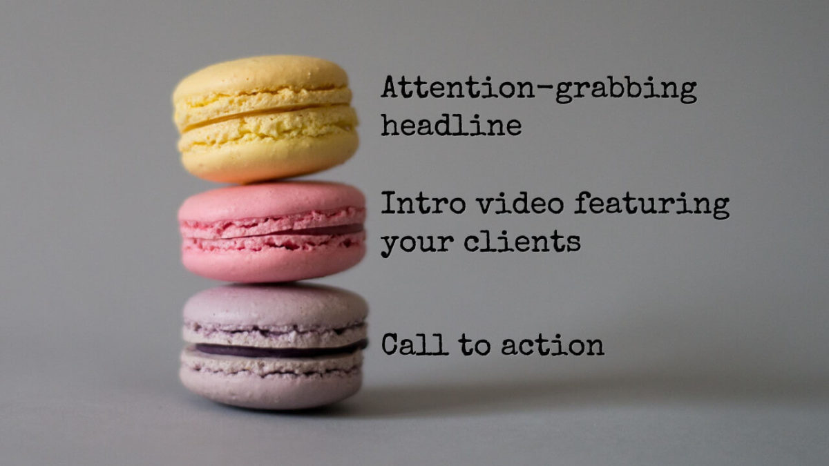
1) Attention-grabbing headline
If you don't catch their attention in 2 seconds, they'll click the back button and go look at other MSPs. Stuck for inspiration? Here are some examples you can swipe & adapt.
2) Intro video featuring clients ~OR~ a photo of you and your team
Videos are better than photos, but photos of real people are better than stock images, or nothing. Our ancient caveman brains are fine tuned to be influenced more by people's faces and gestures than they are by words on a page. That's why the planet is consuming huge amounts of video every day, and most social media platforms' algorithms are image-driven.
The perfect way to introduce your MSP to a stranger is by showing them a 60 second video of your clients talking about how great you are. That requires an investment of time, cash and hassle. So while you're figuring out how to do that, get a professional photographer to shoot you and your team. That's a quick and easy win you could do within the next 7 days.
3) Social proof
This means reviews or testimonials. Reviews are better as they're left on a third party platform such as Google. That gives them greater credibility as you can't edit them. You can screenshot them, or suck them into your website using a plugin such as Trustindex (which allows you to display only the best reviews, and not any bad ones left by nutters).
4) Call to action
The Call To Action, or CTA, is the thing you want someone to do after being on your website. You put this high up because the lower down something is on your website, the fewer people will see it.
The best CTA right now is your live calendar embedded on the page, for them to book a 15 minute Zoom with you. Use Calendly or Microsoft Bookings. This is low commitment enough not to scare off genuine prospects, but high commitment enough to dissuade most time wasters.
The purpose of this exploratory Zoom is for you to ask about their business, get them talking passionately for 20 to 30 mins (that's a good sign of engagement), and then book a proper sales meeting with you.
5) Benefits of working with you
Not the features of what you do. But the benefits of working with you. Sure, these are the same benefits of working with any MSP. But most MSPs are too busy talking about what they do on their website. You can stand out by being different.
Common benefits of working with an MSP include:
- Your staff complain less
- Everyone gets more done
- You sleep better at night as you know your business is protected
- Technology promotes growth rather than holding it back
Notice how these are written in normal friendly language that anyone can understand? Swipe and adapt these examples for your site.
6) Case study videos
You know the clients who appeared in your intro video near the top of the page? Now they each have a 60 second video with a case study about how they've benefitted by working with you.
The format for a great case study video is:
- Set context (“this is a problem many business owners face”)
- Demonstrate relevance (“1 in 4 small business owners will have this IT problem”)
- Lay out the problem
- Poke the pain
- Present the answer (the answer is always something only an IT professional can do)
- Show a happy outcome
Of course you film these at the same time you are filming the intro video. You could even do longer versions to go on your About us page.
7) Something to download
Let them get their hands on something of value without having to enter an email address or go through any other kind of gate. I give an IT Services Buyer's Guide to the members of my MSP Marketing Edge for exactly this purpose (and because actually it's an excellent prospecting tool in many other ways).
8) Three core services
Everyone likes to have three little boxes on their site talking about things they do. Here they are! Make sure you focus on three services people will a) understand and b) ask for.
Most ordinary business owners and managers don't go looking for advanced Azure integration services (even though they may end up buying them)... but they do go looking for basic support and technology strategy.
9) Latest from blog
Make this an automatic feed from your blog. And make sure you blog once a week. The MSP Marketing Edge is built around a Weekly Marketing System that includes a combined blog & video, email, social media, and LinkedIn Newsletter.
10) Trust badges
These are typically logos that add some credibility and authority to your MSP. Make sure they are logos that ordinary business owners and managers know and trust. They are more influenced by the logo of the local radio station that you appeared on, than they are the Datto logo (as they don't know what Datto is).
4) (again) Second call to action
Copy the same CTA you used above. You always need a CTA at the bottom of a page.


